
We celebrate the end of the year the only way we know how: through lists, essays, and mixes. Join us as we explore the music and films that helped define the year. More from this series
This list is a filter. It erases, represses, exaggerates, and distorts. That’s what lists do.
This list is not a competition. It organizes a narrative. There is a message at the end.
This list gives credit. For an end-of-year covers list, that’s ridiculously rare (it may even be a first). A piece of music is more than a sonic treatise, it’s a total object, and, in a majority of cases, the visual component of the object is crucial to its effects.
This list is incomplete. Where such information was unavailable, I tried to source a credit for all listed artwork. Lots of people responded. Some people responded late. One guy never got back to us.
This list is a collaboration. It was compiled with suggestions from Birkut, C Monster, Nikos Giannakopoulos, E. Nagurney, James Parker, Benjamin Pearson, Alan Ranta, Rowan Savage, Tim Terhaar, and Willcoma.
This list is not about music. Why does this need saying? I tried to write about the covers on their own, to give them the respect they are due, and to mention the sonic component of their object only when necessary.
Our album list drops next week. For now, it’s time to stop reading about music and start listening to some covers.

30
David Bowie - The Next Day
Artist: Jonathan Barnbrook
[RCA]
The subject’s face is absent: an anomaly in the wider tradition of Bowie sleeves. An unimposing sans-serif logo centered within a prominent white square announces a new title; a slim, black horizontal barely erases an old one. With a brutal economy of gesture, Jonathan Barnbrook’s forthright reframing of a canonical album cover raises more questions than it answers. Is this an attempt to revive the past (and a comment on the impossibility of doing so)? Or is it, perhaps, an attempt to avoid the past (and a comment on the impossibility of doing so)? Confrontational and irreverent, Barnbrook’s non-portrait demands to know the listener’s stake in something already readymade: the appeal of a world-historical icon.

29
Wanda Group - Outer Alsatian
Artist: Louis Johnstone
[Notown]
Initially — and one suspects deliberately — unprepossessing, a few surprising details complicate attempts at a straightforward reading of this image by Brighton-based experimental artist and beatmaker Louis Johnstone. A clever use of shadow breaks a block of dense squiggle into two overlapping surfaces, bringing the purpose of abstraction into question. Computer-generated patterns of glitch-weave merge with a queasy smear of oils. By combining digital and painterly methods in this way, Johnstone seems to be suggesting an experience of abjection that is common to both humans and computers.

28
The Stranger - Watching Dead Empires In Decay
Artist: Guy Denning
[Modern Love]
A former Stuckist and one of the founding figures of Neomodernism, Guy Denning has made a career out of complicating his own search for a metamodernist realism capable of undermining modernist optimism without succumbing to postmodernist cynicism. His work can often seem like a gloomy satire of classically Romantic concerns, replete with its own unsettling intimations of a universal urban experience that could be considered sublime. Here, a weathered concrete tower block seems to withdraw from a grim street scene, the stark, functional angles of brutalist architecture phasing into oppressive bands of smudge-tone. The windows of this 10-storey building are not intended to open into human lives, but to impress the spectator with a feeling of dread. Denning’s sketch effectively captures a mood of mystery and foreboding.

27
DAT Politics - Powermoon
Artist: Matthieu Bourel
[Tigerbeat6]
Intense and often humorous, the work of digital collagist Matthieu Bourel is full of strange innuendoes and anarchic visual puns. At first glance, it appears as though the subject of this predominantly monochrome image is removing half of his head-planet to reveal a luminous core. However, a closer look reveals the presence of not one, but two figures, their semispherical half-heads almost merging to form a single planet. If the suggestion of a symmetrical kiss carries with it echoes of Aristophanes’ erotic encomium in the Symposium, the use of mantled layers and richly contrasting colors expresses a fundamental disjunction between the violent passions of subjective experience and the grey truths of objective appearance.

26
Julian Lynch - Lines
Artist: Julian Lynch
[Underwater Peoples]
Spidery blue lines impossibly cage this beastly pair, who seem to howl in outrage at the prospect of captivity. The power of this image lies in the conflict between the suggestive heft of the found lions and the frailties of the painted line. There is a fluid sense of sadness here, evoking both the psychic challenge of a repressed trauma and the public filter of performance. By containing a symbol of potency and strength behind such spidery and uneven ranks, the artist subtly demonstrates the primacy of perspective and the distortion of memory. If Lynch, an ethnomusicologist and multi-instrumentalist, has always seemed one of the unlikeliest of troubadours, his cover of Lines offers a frank admission of life behind the curtains, or even, indeed, between the lines.

25
Desmadrados Soldados De Ventura - Striiide
Artist: Rudy Rucker
[Deep Distance]
A pair of bulging eyeballs and an intrusive serpentine limb protrude from a gilt-edged, fleshy pulp that borders the top and bottom of the frame. Their target: a baleful, cartoonish everyman wielding a massive, old-fashioned car-horn that douses his opponent in a stream of fire. On the periphery, two figures address the viewer with quizzical expressions, as if they are challenging her to explain this nonsense. By prioritizing solid lines and the simplification of color and form, this gung-ho comic scene emphasizes the harmless violence of slapstick in a free-flowing doodle-sprawl of Alt. Expressionism. Painter and author Rudy Rucker is the great-great-great-grandson of Hegel and fills out his collection of world-historical namedrops with the claim that he is “the only novelist to have known Kurt Gödel and William Burroughs.”

24
Masayoshi Fujita - Stories
Artist: David Fleck
[Flau]
A diaphanous forest scene rises from an open book; birds scatter from viny trees while leaves gather on the pages below. This understated piece, the work of Glasgow-based illustrator David Fleck, offers an allegorical interpretation of its title theme that is both straightforward and seductive. By linking the impersonal wonders of nature with the narrative tendency of the imagination, Fleck emphasizes the spontaneous creativity inherent in introspective listening. Although the soaring birds and trailing branches suggest there is always something about the story that lies outside of the storyteller’s control, the bright smears of color confirm an essential optimism. These earnest associations might feel hackneyed without a sense of restraint that marvels, but does not indulge.

23
Tropic Of Cancer - Restless Idylls
Artist: Juan Mendez
[Blackest Ever Black]
With its bold compositional structure and vivid use of color, this lurid photograph is both dramatic and ambiguous. Harsh lighting and angled shadows separate layers of high-contrast tones. Three pale rose heads describe a triangle, perched atop the branches of an ornate candelabrum. An outstretched hand intrudes into the bottom-right corner, frozen in the middle of some urgent, inexplicable intervention. A techno producer by trade, Juan Mendez is also responsible for a series of covers that deal with the imagery of instrumentality and violence through the manipulation of recurring visual tropes. Although Mendez’s production background informs his dynamic organization of minimal materials, the immediately distinguishable gothic sensibility is rooted in a record collector’s love of industrial/post-punk culture.

22
Gatekeeper - Young Chronos
Artist: Jaroslaw Kukowski
[Presto?!]
The use of this image raises questions about authorial control and authenticity. The Polish artist Jaroslaw Kukowski identifies himself as a Surrealist, and his work is certainly influenced by the mutant biomorphism of Yves Tanguy and the overblown religiosity of 1950s Dalí. Unfortunately, picking through the occasional lapses into tobacco tin porno-realism among the more conventional Fantasy pieces contained within his patchy web galleries only serves to illustrate just how diluted that concept has become. By electing to pastiche, rather than parody, Kukowski not only tacitly confirms his inferiority as an artist, he partakes in the needless mummification of a decayed form. These issues are wryly acknowledged within the context of the Young Chronos project, a “tongue-in-cheek dystopia” (Nico Callaghan) that satirizes/glorifies the utopian grandeur and sci-fi pomposity of the techno tradition. In different ways, perhaps, sonic cosplayers Gatekeeper and Surrealist manqué Kukowski challenge conventions of good taste.

21
V/A — I Am The Center: Private Issue New Age Music In America 1950-1990
Artist: Gilbert Williams
[Light In The Attic]
Bathed in the light of a glowing celestial orb, a solemn angel hovers above the clouds. This luxuriant composition combines mystical kitsch with a Rococo lightness of touch. Pastel hues toil in search of a serene mood, but the clumsy use of symbolism testifies to a raw outsiderism. Like a lot of New Age art, it’s not immediately obvious whether this picture is intended to calm us or the artist down. In this case, Gilbert Williams describes his work as an attempt to portray “higher dimensional worlds and magical beings,” but what’s fundamentally fascinating about New Age is that so many different artists and musicians spoke the same private language independently of one another. This lavish box-set makes eyecatching use of Williams’ paintings to represent that harmony of concerns, implying not just a movement, but an artist, with a centralizing vision.

20
Conforce - Kinetic Image
Artist: Graphic Surgery
[Delsin]
Techno and street art collide with minimalism and heavy industry on this Process Art-inspired cover. Made with spray paint and stencils, six rows of six “steps” create neo-Cubist rhythms from a grid of brash linear contours and intersections arranged across a blank surface. On projects like Electricity (2011) and Gateway (2013), Amsterdam-based art-and-design duo Graphic Surgery quote the angular silhouettes of the urban-industrial environment in muralistic meditations on color and motion. This ludic puzzle of line and form venerates mechanization in terms of grace and purity.

19
BOY FROOT - LOOTERS MIXTAPE
Artist: Jay Harmon
[Self-Released]
The compositional structure of this mixed media collage may contain a sly allusion to the cover of The Next Day that is easily lost within a discordant blend of unsettling juxtapositions. A cheap horror-punk font splatters clumsily across the head of the page, partially obscuring a blur of monochrome inks. The viewer’s gaze is directed toward the margins by an opaque square of naively rendered Op Art that shimmers in the center of the frame. A glutinous substance dribbles over a pair of incongruous cartoonish eyeballs that address the viewer from within the square. To the right of the frame, three spectators gather warily in the background while an attentive police dog bares its teeth at an unseen master. To the left, two indistinguishable policemen stare off-page right, themselves seemingly daunted behind their symbols of authority. Rapper-producer-painter Jay Harmon, a senior-year student at the Art Academy of Cincinnati, uses crude photomontage techniques and deliberately clumsy ornamental frills to convey a mood of sardonic menace.

18
Wormlust - The Feral Wisdom
Artist: Metastazis
[Demonhood]
The enigmatic French designer Sect Metastazis has built up an impressive client-base within the fervid microclimate of the Black Metal underground, with a portfolio including covers for the likes of Heretoir, Watain (screen-printed in his own blood), Lutomysl, and Ascension. His manifesto may be uncompromising — “Metastazis does not obey its clients” is one of many slogans discouraging a lengthy consultation process — but his prowess is easily perceivable. On the cover of The Feral Wisdom, anxious serpents cower before a planet-headed seraphic figure that springs from the page in a festival of coiled lines. Bold contrasts and anamorphic mischief characterize this deceptively simple game of reflections. Describing his intentions in an interview from 2011, Metastazis observed: “The big issue with the musical scenes I work with is that they take themselves far too seriously, to the point that you can’t take their message seriously… humor will make your message credible, human, and will bring people to reflection much more than a terrifying manifesto about the end of the world written in old Romanian.”

17
Old Apparatus - Compendium
Artist: OA1
[Sullen Tone]
Red and gold outlines dominate this caliginous portrait, a three-color reworking of a two-color original. A monolithic robot-being, corona backlit in hooded robes, towers above the waves like a cybernetic Poseidon. The imposing halo and inscrutable mask-assemblage of this gigantic figure exaggerates the power of the anonymous artist-producer, although the use of obsolete machinery implies that deterioration is possible at any moment. The members of elusive audio-visual collective Old Apparatus tend to work alone, basing their distinctive sonic universe upon the ideas and associations brought up by individual readings of the uncanny visual creations of member OA1. Her ramshackle rust-and-guts aesthetic recalls the self-propelling metamechanical sculptures of Jean Tinguely and the post-apocalyptic musings of theorypunk Evan Calder Williams.

16
Ákos Rózmann - Images Of The Dream And Death
Artist: Stephen O’Malley
[Ideologic Organ]
This poetic organization of Far Eastern signifiers is rich with hallucinatory implications without being straightforward. Look closely: a maroon horizontal line supports a black square within a quadrilangular olive block. A large pair of eyes, nesting within prominent palpebral folds and a painted brow, hovers drowsily above the unmistakeable features of the Tibetan Snow Lion, which poke out of the square below. A slit between the Lion’s brow opens on to a rogue third eye, trailing from a tell-tale plume of smoke that traverses the two blocks. Take a step back: the brow of the Lion becomes a nose and a larger face appears, dominating the canvas. Between the eyes of this new face, the painted brow and trail of smoke also assume a human/seraphic aspect.
The Snow Lion symbolizes ecstasy: this imaginary being is said to bound across the mountain peaks of the Tibetan Plateau, its feet never touching the ground in a simulation of boundlessness. The three human eyes could conceivably suggest a psychoactive means of contact with supernatural states of bliss, although the contrast between the watchful, sinister expression of the Lion and the larger, fatigued human eyeballs makes it clear that such ingress is not to be taken lightly. O’Malley’s reputation as an avant-garde guitarist-composer is well-established, but the exquisite poise of his cover designs, informed by a lifelong engagement with sonic extremes, is also deserving of wider acclaim.

15
Gubia - Polillas Gusanas
Artist: Maureen Gubia
[Self-Released]
Maureen Gubia is an Ecuadorian painter and musician. With Matinée (2005), she compiled a series of mottled sketches that each attempted to portray “children at birthday parties in the company of hopeless adults.” Other works show off her considerable illustrative skills in combination with a flair for gaudy colors that seethe with weird energies. Ambivalence nestles within the polychromatic folds of her astonishing cover for Polillas Gusanas: the motive behind a smile is always harder to read behind violent splotches of melting face. Perhaps anxieties about ageing and death (witness the blood-red smear across the forehead) are being implied; perhaps the many faces of one person cannot be orderly expressed as a whole. Perusing the works in her online gallery, it’s hard to avoid the sensation of a dual Freudianism, where the cathectic slippages of Sigmund’s dream-works are rendered with the bleak intensity of Lucien’s paintings.

14
Seven Teares - Power Ballads
Artist: Dawn Frasch
[Northern Spy]
This terrifying image depicts a bloodbath of caricatural forms. A two-headed feminine monster, her sagging genitals incongruous between hypertrophic quads, crushes a snake underfoot. She contentedly offers a testicular carcass to her right, where an eagle chews on a visceral thread. Dawn Frasch’s painting on Power Ballads is one of the year’s most memorable covers. If the use of vibrant textures and spontaneous, irregular lines recalls the irrational compositions of Art Informel, the frenzied subject matter is characteristic of the artist’s preoccupation with the anxieties of embodiment. Her writhing, fluid figures exaggerate the complicated ebb and flow of aggressivity and sexuality, violence and gender, in a striking fashion that brings to mind the Necronautic principle of “comedy over tragedy: that is, incompleteness, rupture, and mess, over neatness, uniqueness, and transcendence.”

13
Omar Rodriguez Lopez Group - Woman Gives Birth To Tomato!
Artist: Jeff Jordan
[Rodriguez Lopez Productions]
This snazzy pair find themselves in a delicate situation. An over-sized tomato slice sits between the legs of its (human) mother, who sprawls across the center of the image in a glamorous dress. A commercial pilot smokes a cigarette at the mothers’ side, his attention focused on her at the expense of the infant nightshade. By offering a literal representation of its title, this collage-in-oils has all the strangeness of an improbable metaphor. The failure of either parent to address the viewer, and the kaleidoscopic churn of their limbs, suggest that the meaning of this private circuit of consolation will always be out of reach. Perhaps the tomato, alone at the moment of its original alienation, addresses the spectator as a fellow exile from the land of reason? (Bumper sticker reading: “we are the tomato”). Like the paintings of Jaroslaw Kukowski (above), Jeff Jordan’s work is strongly influenced by Surrealism, although Jordan’s proficiency as a commercial artist and flamboyant juxtapositions situate his distinctively Lowbrow compositions somewhere between the lucid psychedelia of Moebius’ bandes dessinées and the sibylline humor of Magritte.

12
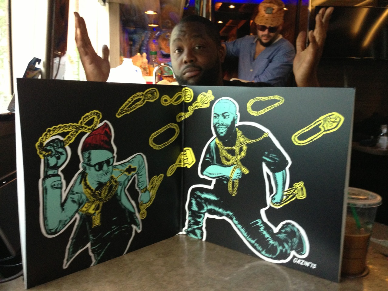
Run The Jewels - Run The Jewels
Artist: Nicholas Gazin
[Fool’s Gold]
Two pale, ghoulish hands describe a stick-up scene with comic book vigor on Nick Gazin’s Run The Jewels cover. The dookie rope chain in the right hand has powerful old school connotations, while the fingerpistol on the left is an aggressive act of interrogation and/or a notice of intent to dispossess. In this sense, Gazin’s sleeve implies that exuberance and tradition are not mutually exclusive: the old school is something to be seized, customized, and passed on. Gazin’s imagery on the cover and inside the gatefold displays an eye for composition rooted in the improvised arrangements of sticker art. Gazin’s illustrative work for VICE and Fool’s Gold is prepossessing without being cute, and weird without being vague.

11
Nate Young - Regression “Blinding Confusion”
Artist: Nate Young
[NNA Tapes]
Multi-instrumentalist and illustrator Nate Young is known for attacking the page with the same zeal with which he attacks his instruments. In a TMT interview with John Crowell from 2011, he admitted: “When I first started drawing and playing music as a teenager, my ultimate goal was to make drawings with recordings on them.” The evocative sketch on the front of “Blinding Confusion” exaggerates the physical cost of performance and the stupefaction inherent in any technical framework. The rotting skeleton emphasizes the transcendental aspect of productivity in terms of the death of the ego, while, simultaneously, a confusion of ulnar and humeral folds aligned to the right of the frame emphasizes the tactile, dislocatory force of representation. The minimal use of red ink connects the disembodied eye in the left-hand corner with a single distal phalange, implying a violent (blood red) interrelationship between artist (sore finger) and spectator (disembodied gaze). A lifelong Michigander, Young has been explicit about the way in which his bleak aesthetic vision is informed by the day-to-day pressures of life in his home state.

10
Oneohtrix Point Never - R Plus Seven
Artist: Robert Beatty
[Warp]
Despite a growing reputation as a musician in his own right, Hair Police and Burning Star Core member Robert Beatty might also be justifiably recognized as one of the distinctive visual voices of his age. Working across several media, his frequently exquisite designs — a lot of which can be seen on his Flickr page — blend mystery and kitsch in a way that recalls both the intellectually playful sensibility of 60s underground psychedelia and the black humor of the Surrealists. This image is based on a still from George Schwizgebel’s short film The Rapture of Frank N. Stein (watch it here). It depicts a melancholic encounter between two cuboids, in a way that is both touching and absurd. If the use of shadow signifies distance and solitude, a third cuboid, opening onto a corridor of partially obscured geometrical presences, carries with it a vague sense of threat. Whereas the melting telephone of Beatty’s Three Legged Race cover alluded to the work of Salvador Dalí, the dreamlike poignancy of his R Plus Seven cover is surely reminiscent of de Chirico’s Metaphysical Painting.

09
Nite Lite - Megrez
Artist: Myste French
[Desire Path]
This beautifully organized collage has been assembled with great care. The image wonderfully evokes the biomorphic cacophony that dwells beneath the surface of the earth and the sea. The attention to detail in many of the figures suggests material sourced from scientific illustration has been variously doubled, embellished, or defaced. This collagist’s eye for the strange and the beautiful in nature resonates with the music within — a patchwork of field recordings (animal calls and weather phenomena) and scintillating tonal improvisations that emphasize the sense-bending properties of the edit. Starting out in Long Beach but later relocating to Portland, Myste French used to run Stunned Records with husband-collaborator Phil. Comparing the cover of Megrez to the art on Stunned releases like the Foundation Stones box set, it’s obvious that French’s dense visual works express a coherent aesthetic that archly alludes to the mutant plenitude of the underground.

08
Salvia Plath - The Bardo Story
Artist: Robert Beatty
[Weird World]
Distorted, phantasmagoric imagery glows with lysergic optimism on the second Robert Beatty cover of our list. Smokeforms hover in an airbrushed orange chamber that opens on to a bright, nearly cloudless sky. The features of a heart-shaped head, situated to the right of the chamber, mirror the appearance of a polychromatic dove-form by its side. Decoratively flanked by orange-and-black zig-zags that flash illusorily, this sleeve is intended to resemble the cover of a paperback novel. Earlier this year, Michael Collins a.k.a. Salvia Plath told Ad Hoc: “The cover is based on an experience that I had on salvia, and goes behind the scenes of everything that I saw… It’s beautiful how true [tripping] can be, and also similarly how hilarious it is, and I think it’s kind of one of those things where your perception of reality is changed and afterwards you realize that you can think of everything you look at as being the cover and everything else you can’t see is the book.”

07
Le1f - Tree House
Artist: Nick Widmer
[Self-Released]
Ta-da! You were expecting… Batman? This photoshoot with Nick Widmer recasts Le1f as a mutant superhero in spandex and fur. The subject matter of hip-hop portraiture strives to be larger than life, realer than real, and this uplifting image is no different. The Tree House cover harks back to Rap’s Age of Flamboyance, with Le1f participating in the same tradition of dressing out as Afrika Bambaataa, the Furious Five, and Rammellzee.

06
Miles - Unsecured
Artist: Shlom Sviri
[Modern Love]
This stretch of sea, bathed in eerie luminosity, glistens with dots and curves. Rainfall prickles so precisely and crisply that the picture appears cold to the touch. The viewer encounters this scene from the perspective of the gods: the forms of natural objects are transformed into abstract representations. The dimensions of the boat, relative to the sea, emphasize the dominance of nature over man. The image evokes feelings for the beauty of nature and the freedom of solitude. Boomkat founder and Modern Love label head Shlom Sviri has unearthed some archival gems in recent years, sourcing celebrated cover images for Andy Stott (Passed Me By, Luxury Problems), Miles Whittaker (Unsecured) and Suum Cuique (Ascetic Ideals) from the NGS library.

05
Colleen - The Weighing Of The Heart
Artist: Iker Spozio
[Second Language]
This gorgeous cover art creates a mood of intimacy and wonder. The subtly-ordered geometrical rhythms of its fragmented surfaces, seemingly arranged in no logical configuration, rely on a private symbolism of organic forms. The giraffe represents the fragile, awkward character of beauty. The constellations in the night sky suggest the value of inner experience, of staring at the void. The open book implies a love of study and the importance of practice. Charming, delicate, and full of poetry, this is a cover for daydreamers and romantics. Donostia-based artist Iker Spozio’s work will already be familiar to psych/space heads the world over thanks to his design and illustration work for legendary cosmic music zine Ptolemaic Terrascope. He has collaborated with his partner Cécile Schott a.k.a. Colleen on a number of projects, including Morning, a zine devoted to unearthing psych historiana. Spozio’s designs display a love for history without being either straightforwardly retro or revisionist.

04
Plankton Wat - Drifter’s Temple
Artist: Phil French
[Thrill Jockey]
A totemic core of skull and flower at the center of this bustling collage implies a regenerative cycle of bloom and decay. A huntsman stands before a sumptuous curtain of emerald leaves. A pair of antlers protrude from his forehead, symbolizing the potency of his relationship to nature. However, the spectacular arrangement of fronds and plumage that surrounds this drab figure makes him appear shabby and ridiculous by comparison, a hobo shouting at the sky. The designer, Phil French, came to prominence in the latter half of the 00s as a member of Magic Lantern and Super Minerals. He used to run Stunned Records alongside his wife and collaborator Myste, an audio-visual artist herself (see above). The Frenches’ cover designs treat nature as a source of retreat from the dreariness of anthropoid bias. Their collages are full of optimism about all that is weird and extraordinary in life.

03
Cream Juice - Man Feelings
Artists: Keith Rankin/Seth Graham
[Orange Milk]
An extraterrestrial is on the phone. Can he speak human? The expression on his face, a ball of anxiety and confusion, suggests not — and yet he continues to speak. This image of thwarted communication exaggerates the comic aspect of the conflict between humanity’s raw emotionalism and stereotypically masculine communicative behavior. Forced to deny their need for emotional security or else to translate it into a surrogate desire, the male stereotype is an alien to his emotions. If that reading is too phallogocentric for your tastes (although it is guided by the title), then perhaps the image simply refers to the universal anxieties that arise in infancy when humans are called upon to set their jouissance aside in order to access the linguistic dimension of communication. Uptown Keith Rankin and Seth Graham run Orange Milk out of Brooklyn, and their effervescent designs have played a significant role in establishing the label’s unique reputation. Glitzy, brash, and throwaway, this cover seems to explode from the J-card in a triumph of the absurd.

02
Andrew Pekler - Cover Versions
Artist: Andrew Pekler
[Senufo Editions]
Exhibited at Berlin’s Laura Mars gallery prior to album launch, the 300 covers of Cover Versions all enjoyed past lives on the sleeves of other, less Pekler, releases. By obliterating any sign of former artistic credit with a vocabulary of brightly colored geometric forms, Pekler unites a series of superficially discrete images whose only other common ground is non-visual. This act of appropriation and recycling doesn’t merely dramatize the relationship of music to the materials of its transmission: it also brings the arbitrariness of audio-visual associations into question. Perhaps these strange constellations of decorative erasure are the real visual component of Pekler’s work with samplers. Perhaps one day these covers will be re-versioned once more.

01
Lil B - Pink Flame
Artist: Uncle Grumpy Inc. a.k.a. Young Van Gogh
[Self-Released]
You are what you love.
What you love is beautiful.
You are beautiful.
#tinymixtapes

We celebrate the end of the year the only way we know how: through lists, essays, and mixes. Join us as we explore the music and films that helped define the year. More from this series