We celebrate the end of the year the only way we know how: through lists, essays, and mixes. Join us as we explore the music and films that helped define the year. More from this series
10
Rome Fortune - Small VVorld
ARTIST: ZOA
[Self-Released]

An intimate scene is scarcely disrupted by the threat of violence. Two tides run against one another here. First, there is the couple in the bath, their nakedness suggestive of revelation and disclosure, a single gaze made up of two aspects — masculine territoriality and feminine disgust. The quiet confidence of this dispassionate duo undermines the rhetorical power of the gun. There is something unconvincing about this weapon in the center of the frame. It has induced the woman to cover her breasts. We could live without that. We want truth and honesty, epiphany and nakedness. Perhaps the unconvincing thing about this gun is that we, the audience, seem to be holding it. Who are we? What do we want from Rome Fortune? What is Rome Fortune going to give us?
09
Arca - Xen
ARTIST: JESSE KANDA
[Mute]
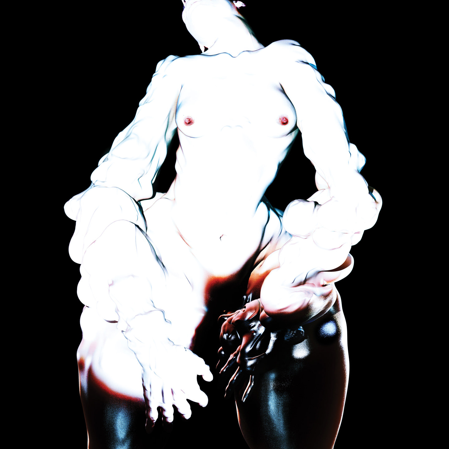
The eponymous, androgynous Xen is a digital being whose anti-aliased portraits populate Jesse Kanda’s eerie album art. Within the framework of Kanda’s haute Weird blend of the Sexy and the Wrong, the lopsided rhythms and dissonant electronic textures of Xen throb with all the nauseating energy of a repressed desire. By the same token, Kanda’s computer-generated teratology profits enormously from its association with his housemate Arca’s hallucinatory trap-art.
08
Mo Kolours - Mo Kolours
ARTIST: MIJU LEE
[One-Handed]

Both soulful and delicate, this stark ideogram of an annular head pared down to its anthropomorphic essentials resembles a melancholy vinyl disc. Its curious gaze addresses the viewer from the center of this eloquent illustration. For Korean artist Miju Lee, the purpose of art is to make contact with the world. To this end, her miniature sculptures can be found dotted throughout her adopted hometown of Barcelona. Furthermore, her love of visual puns can even be enjoyed at the dinner table.
07
copeland - Because I’m Worth It
ARTIST: n/a
[Self-Released]

Hype Williams’ refusal to speak clearly was itself interpreted as clear speech. The slippery, amorphous nature of their art was a large part of its appeal. A personal opinion is that the band became a bigger story than anything specific they tried to accomplish: the impact of their art became limited by their own presence. Their audience got used to them. There was never supposed to be a grand narrative about the relationship between Dean and Inga, that’s just how things turned out — they weren’t even supposed to change the band name, nobody was supposed to care. The dual solo act retains their audience and doubles their money. In 2011, Inga observed: “if you make music under an umbrella of an atmosphere, you can change the sound completely, or you can get rid of your gimmicks or whatever and do something else, still doing the same thing within your sort of intention.” Because I’m Worth It is a Hype Williams atmosphere with Inga on the cover. What makes this image of a glassy-eyed, greasy-haired Inga so powerful isn’t the anti-corporate message it apparently transmits, but the possibility that this gesture of unmediated rawness is just another artistic imposture.
06
Hookworms - The Hum
ARTIST: JW
[Domino]
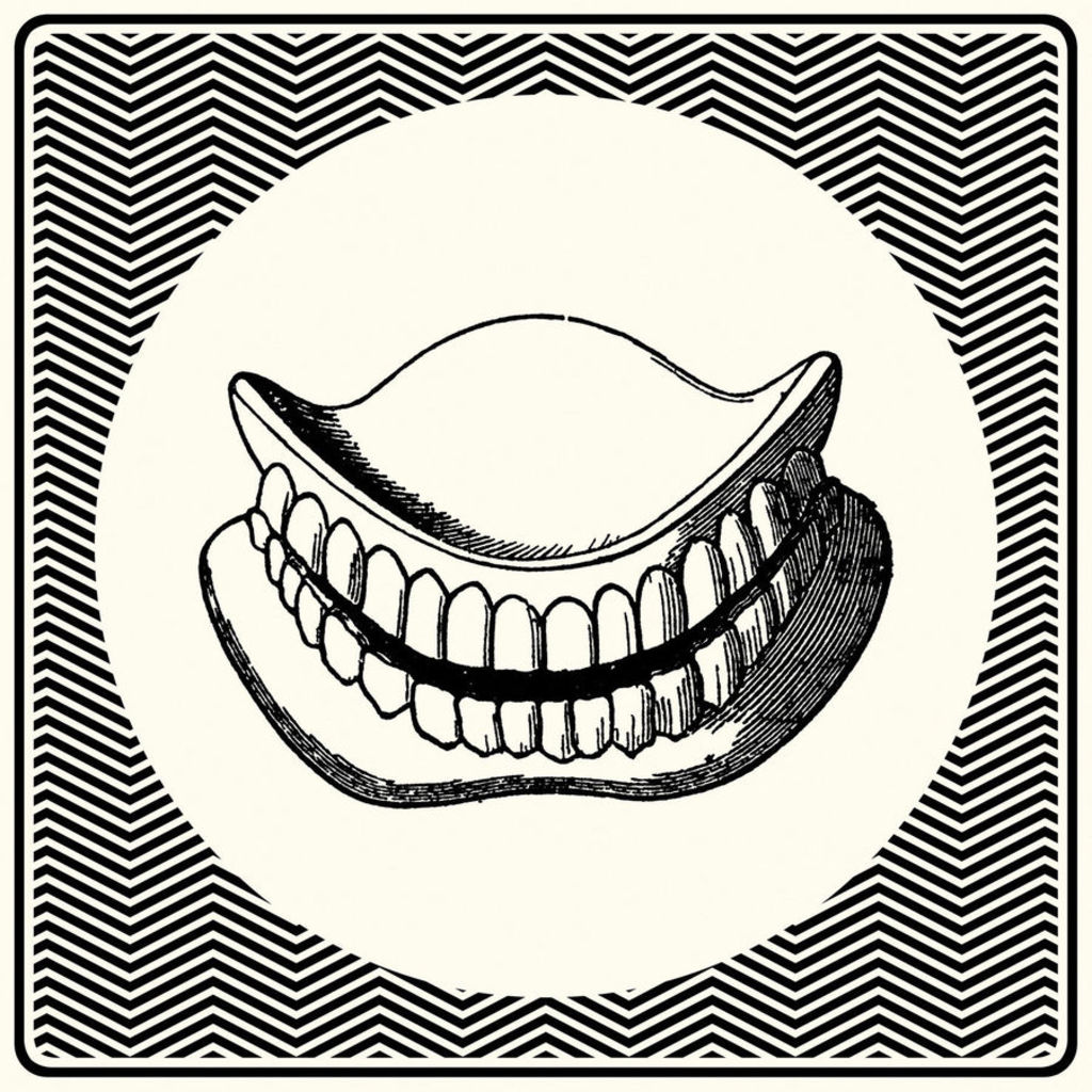
You draw these false teeth from their die-cut sleeve. Sourced from a 19th-century medical textbook, they are awkward but vital. Without them, you can’t speak, can’t smile, can’t eat. They are at once weapon and lifesaver, filter and preamp.
05
SOPHIE - Lemonade
ARTIST: SOPHIE
[Numbers]

The sonic and visual art of SOPHIE is self-consciously grounded in the act of processing materials according to their inherent properties. The essentialist (molecular) aspect of his work is hard to miss: his jerky, mechanical body music never digresses into musicality for its own sake; his command of his own message makes his responses to interview questions seem a priori. According to SOPHIE: “Aesthetic aims should be secondary to conceptual aims, otherwise you end up with music that is driven by stylistic references rather than its actual content.” The content — understood as essence — is the key. LEMONADE is a study of effervescence. A corkscrew flume (water slide 02 am94) dangles like lemon peel. Freed of function and estranged from its social context, its formal qualities are emphasized, its sensual qualities exaggerated.
04
Eric Copeland - Logo My Ego
ARTIST: ERIC COPELAND
[L.I.E.S.]
![]()
A smudgewave aesthetic smears discordant concepts into a tape-saturated whole. Its primitive analogue processes emphasize trash and dirt, its practitioners magpie whimsy from the post-everything archive of the web. The world is your bedroom. To create is to assemble. Sounds become grooves when they are found, fixed, and altered. Images become covers when they are sliced up and taped back together. Smudgewave is too serious, too involved, to be purely Pop; and it’s too dumb, too spontaneous, to be purely Conceptual. Asked to situate his experimentalism within a wider cultural milieu, New York-based collagist Eric Copeland responded: “I want to have some seriousness, and demonstrate some things I think are really important and maybe hidden in it, but then I want it to be attractive in a stupid way. I don’t think there’s anything bad about something being dumb or idiotic or really basic. I don’t know if that’s cartoony, but I think I share a cultural space with it.”
03
Rustie - Green Language
ARTIST: SIMEN JOHAN
[Warp]
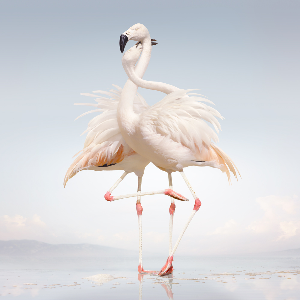
Birds in general disturb human perspectives: their eyesight is keener, their horizons wider; their use of song makes them seem inherently musical. These charismatic flamingos, social creatures of color and dance, represent an ideal for living on the front of Rustie’s Green Language. The longer one looks at them, the more human they seem. They could be any couple in a corner at the club, the figure on the left nagging haptic at the collar of the figure on the right. The comparison doesn’t make them seem humdrum; it reminds us that humans can be strange and graceful. This digitally-altered photoprint (Untitled 163, 2011) is part of an ongoing series called Until The Kingdom Comes by New York-based Norwegian artist Simen Johan. Johan prints inverse “negatives” of his computer-manipulated photographs onto transparent film, allowing him to produce hyperrealistic prints using darkroom processes.
02
Burial Hex - The Hierophant
ARTIST: BERNAT ARMANGUE
[Handmade Birds]

The dynamism and expressiveness of this photograph are created by the contrast between the crimson horns smeared across the floor and the blood-stained horns of the fallen bovine. Although we are in the presence of death, the point of intersection between the throat of the bull and the sickle-like contours of blood suggests a fantastic parody of breath. In the context of Kevin Gan Yuen’s opulent presentation of The Hierophant, Catalan photojournalist Bernat Armangue has (intentionally or not) produced an image rich in Mithraic connotations.
01
FINISHED - Their Is No God
ARTIST: E3
[A1 Tapes]
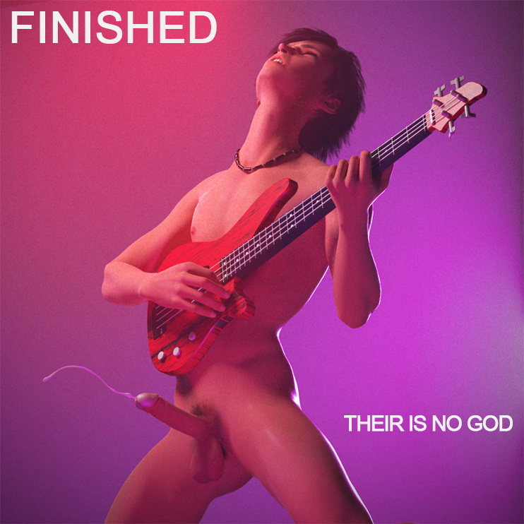
Music is either NSFW or it is nothing.
We celebrate the end of the year the only way we know how: through lists, essays, and mixes. Join us as we explore the music and films that helped define the year. More from this series