We celebrate the end of the year the only way we know how: through lists, essays, and mixes. Join us as we explore the music and films that helped define the year. More from this series
Lists are like dreams and fingerprints. No two are exactly alike. Print that out in Comic Sans and stick it above your desk.
30
Aphex Twin - Syro
STUDIO: MITDR™
[Warp]

The immaterial transaction of listening and the economic activities of the music industry are explicitly foregrounded in this work of putative non-design. An itemized bill presents the cost of packaging, promoting, and producing Syro, with various acquisitions, meetings, and pursuits valued and accounted for as a fraction of the retail price of a single unit. According to Ian Anderson, director of The Designers Republic, the goal of the Syro art is to pose “questions of the consumer that the content can’t alone.” Richard D. James himself describes the art as “completely culturally deprogrammed… cold microdot vibe, basically.” Syro was also the first ever Aphex release to include a kit list, prompting eager Reddit users to compile this spreadsheet… before it turned out that the kit list was a deliberately incomplete “disinfographic.”
29
Kane West - Western Beats
ARTIST: GUS LOBBAN
[PC Music]

This cover is all about the use of Comic Sans, a thought-provoking anti-design gesture along the same lines as Syro. A report in The New York Times has claimed that readers are less likely to accept as true information presented in Comic Sans compared to information presented in other, more respectable fonts (Georgia, Helvetica). A more robust article in Cognition claimed to provide evidence that uglier fonts such as Comic Sans were harder to read, and that readers experienced faster recollection of information provided in such fonts. If these studies are accurate, the use of Comic Sans on the cover of Western Beats emphasizes the visual pun that links the name of the artist to one of the more acclaimed rap stars of the age, in a letterform that requires deeper cognitive processing to read and is therefore easier to remember.
28
Richard Pinhas & Yoshida Tatsuya - Welcome In The Void
ARTIST: YANN LEGENDRE
[Cuneiform]
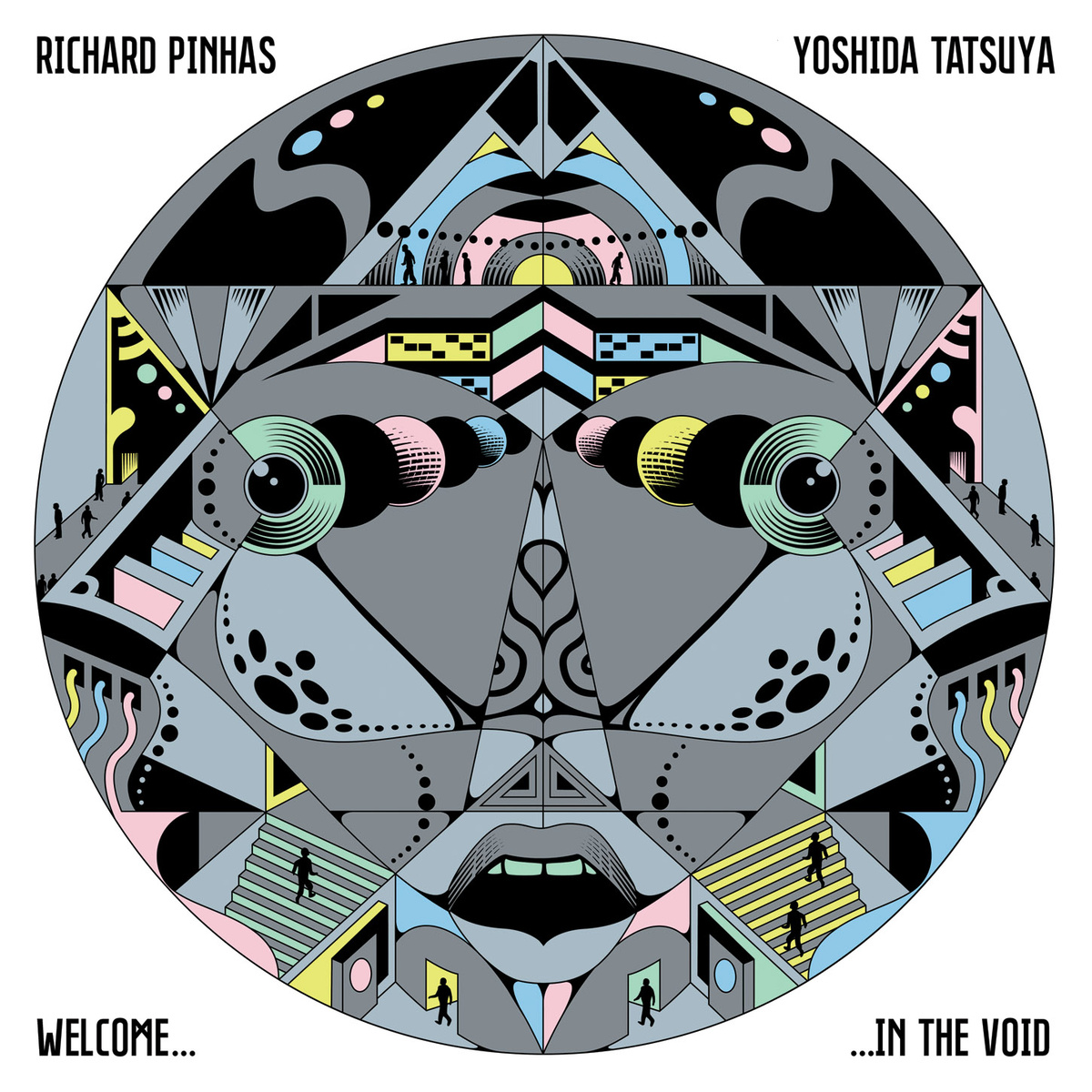
The philosopher/musician Richard Pinhas’s Devolution Trilogy is explicitly devoted to the idea of humankind’s cybernetic degradation. The second part of that trilogy, Welcome In The Void, is a ramble through what Pinhas calls “the nothingness that is now the ‘center’ or the absence-of-center of our societies.” By portraying humanity as a group of tiny, faceless silhouettes, each going about their business within a tastefully-colored maze of tunnels and staircases that, combined, resemble a face, French designer Yann Legendre suggests that the system has a clearer identity than the actors lost within it.
27
Half Japanese - Refreshing
ARTIST: JAD FAIR
[Joyful Noise]

2014 saw the return of brothers Jad and David Fair, better known as post-fi pioneers Half-Japanese, after a 13-year break. To mark the occasion, their label, Joyful Noise, declared that Jad Fair was also their official artist-in-residence for the year. Fair’s signature paper-cuttings are densely-ordered games of symmetry played with scissors, generating bold figures and strange relationships within stark scenes of love, hope, and mystery. Pressed on to dual-color 7-inch, the Refreshing cover art was a typically low-key work of celebratory vigor and contagious small-scale optimism.
26
Arrington de Dionyso & Senyawa - Unheard Indonesia Vol. 5
ARTIST: ARRINGTON DE DIONYSO
[Self-Released]
Arrington de Dionyso’s methodological inspiration springs from the conceptual sweet spot where punk’s DIY morality of the moment overlaps with the quotidian character of Rajasthani folk art. The thinking behind this engagement with the sonic and visual cultures of Indonesia is well-documented in a conversation with Benjamin Pearson published in TMT last year. The artist reveals that his painting and playing are both informed by the same sense of life-consuming intensity in which “producing art is part of the larger cycle of your life.” His distinctive crookedness in either discipline serves as the enchanted signature on a million ecstatic portraits of “the spirits that are inspiring me and setting my brain on fire.”
25
Hieroglyphic Being & The Configurative Or Modular Me Trio - Seer Of Cosmic Visions
ARTIST: KRISS STRESS
[Planet Mu]
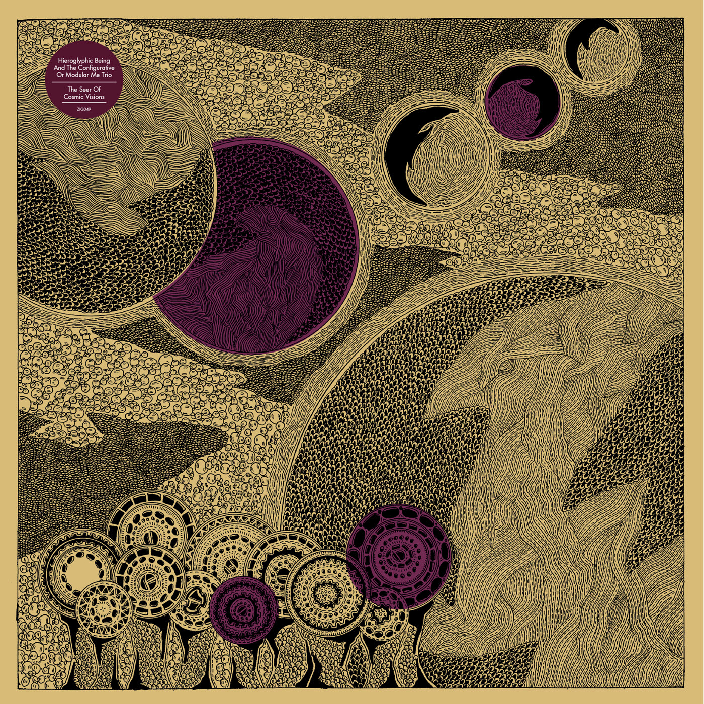
Kriss Stress is probably best known as a serial podcaster and archivist of the Chicago Underground Music Scene. The Windy City connection links him to Jamal Moss, the avant Chi-house DJ/producer whose work as Hieroglyphic Being is to Trax as Sun Ra is to Blue Note. Stress has been publishing his own sketch-zines for years, refining a heavily-textured style he calls scrawlcore. The meditative repetition of geometric forms and granular rhythms of detail on the Seer Of Cosmic Visions cover fit perfectly with Moss’s visionary post-industrial percolations.
24
Great Dane - Beta Cat
ARTIST: EMILY BAYER
[Alpha Pup]

If the internet is a series of tubes and they are full of cats, then the role of album art in the digital age is to be instantly recognizable as a thumbnail in a grid of competing cats. Emily Bayer’s aggressive act of omission tests the durability of the cat as a cipher for the internet’s memetic zeal.
23
Meow The Jewels - Meow The Jewels
ARTIST: JOEL NIXON
[Self-Released]

The release of Run The Jewels 2 offered listeners various special packages at a variety of price points. At the higher end of the scale, $100,000 secured the Fuck Boy Revenge package (“This offer does not include murder”) and $350,000 fetched the Self-Righteousness For Sale package (“Run The Jewels will spend six months pretending to care about whatever you care about. We will travel to no more than three events of your choosing and make eloquent, timely speeches on your behalf”). The middle-tier $40,000 Meow The Jewels package offered to re-record the album “using nothing but cat sounds for music.” One successfully funded Kickstarter project later and Meow The Jewels is real. Joel Nixon’s feline-themed rework of Nick Gazin’s cover art (itself a variation of the original RTJ cover, which made our 2013 list) commemorates one of the unlikeliest episodes in recent hip-hop history.
22
Bloodway - Sunstone Voyager and the Clandestine Horizon
ARTIST: COSTIN CHIOREANU
[I, Voidhanger]

Despite/because of its apparent simplicity, this dramatic composition combines metal art’s characteristically overwrought sense of expression with the full-blooded commitment to symbolism typical of progfusion. All doomy psychedelia wrapped in comic book outlines, the lysergic angst of Costin Chioreanu’s boldly-inked fantasy-rock cartoons brings to mind some of the album art on show within Matthew Ingram’s delightful compendium 100 Lost Rock Albums From The 1970s. The dual sense of stoned sincerity and cynicism-free conviction suggests we are in the presence of a true believer, lighting pictorial candles for a Romantic vision of rock as a seeker’s medium.
21
Todd Terje - It’s Album Time
ARTIST: BENDIK KALTENBORN
[Olsen]

Formal contrasts and eye-catching reflections frame this caricature of the producer as a Cerrone clone. Surrounded by cocktails and palm fronds, chest hair straggling from his unbuttoned V-neck shirt, Todd Terje seems tired and pensive at the piano, weighed down with materialist wisdom. The image of the disco don as a world-weary bon vivant is brought to life with the comic vigor characteristic of Norwegian designer Bendik Kaltenborn’s New Yorker illustrations.
20
VHS Head - Persistence Of Vision
ARTIST: MICHAEL ENGLAND
[Skam]
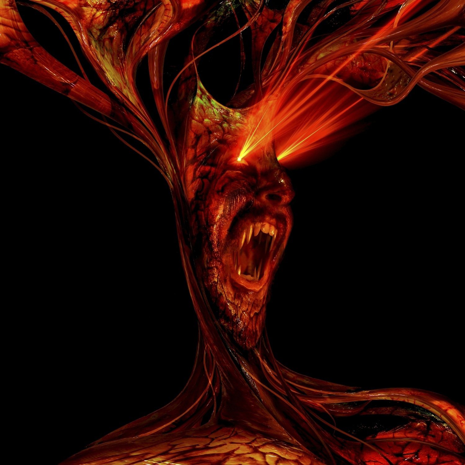
Cephalopodan appendages splay like cosmic antlers and rave lasers fire from squinting eyes. With its fanged maw opened wide, this digital fiend could be roaring in dismay at its own reflection or simply chortling at a passing puny mortal. Mysterium tremendum et fascinans. Both ridiculous and slightly terrifying, Michael England’s pop surrealist homage to video nasty kitsch is the perfect complement to VHS Head’s gory microhouse repurposing of supernatural horror and slasher cinema.
19
Ignatz & De Stervende Honden -Teenage Boys
ARTIST: DENNIS TYFUS
[Ultra Eczema]

This two-color screenprinted sleeve playfully refers to the psychedelic potential of reflection. The anamorphic use of feminine features and soft curves in a queasy pastel haze recall the artist’s earlier work for Jessica Rylan and Samara Lubelski. Belgian artist and provocateur Dennis Tyfus began the Ultra Eczema label as a bad taste zine before branching out into noise-rock, tees (UE06), tattoos (UE50) and soccer teams (UE164). Asked to describe the ideal Ultra Eczema project, Tyfus replied: “Three babies, signed and handnumbered. All their sounds will be recorded non-stop and every sound will appear on brown vinyl packed in a diaper. If I had the time to raise them, I would only sing to them, no talking, just singing.”
:format(jpeg):mode_rgb()/discogs-images/R-739605-1336940428-1857.jpeg.jpg)
:format(jpeg):mode_rgb()/discogs-images/R-5544024-1396116724-7548.jpeg.jpg)
18
Michael Jackson - Xscape
ARTIST: n/a
[Epic]

A world-historical figure is partially obscured within a cosmic bodystocking. Victor Hugo once described the octopus (“the sea vampire”) as “a sleeve sewn up with a closed fist within.” The figure on the cover of Xscape is similarly stuffed with oddly violent connotations. Jackson’s intergalactic cloak seems to confirm his pre-eminence in the firmament, but a vortex swirling about his ears threatens to consume him completely. The singer himself seems predatory, lurking behind his interstellar veil, watching, waiting; an ambush waiting to happen. He is a young and anxious God, scanning the souls of the faithful, determined not to be forgotten.
17
Moodymann - Moodymann
ARTIST: KEN KARNER
[Mahogani]

There was a time when Kenny Dixon Jr. barely existed as a visual image. The monochrome portrait from the cover of his debut album, Silentintroduction, would serve as the seal of quality: confirmation that, yes, that hypnotic 11-minute analogue house track that sounds like it was produced by Moodymann was, in fact, produced by Moodymann. Such putative anonymity felt contrived even at the time. Nobody sounds like Moodymann, not really; especially not when KDJ takes to the mic and starts to mutter his hedonistic daydreams aloud. Ken Karner’s cover art for the Moodymann album illustrates how caricature provides its own level of anonymity: the oddball party animal that exists on record assumes the form of a beer-bellied giant on the poster of his own Blaxploitation movie.
16
Kris Wadsworth - Popularity
ARTIST: ZEKE CLOUGH
[Hypercolour]

Skulls, robots, skulls, breasts, eyeballs, breasts, skulls, ghosts, trees, saws, sores, skulls, spines, brains, breasts, and skulls: the discarded ideograms of a Crumbian nightmare writhe and sprawl in groggy rapture. Zeke Clough’s illustrations are always a riot. Although his frenzied cartoons will often be tied to the releases of DJ/producer Shackleton, whose singular mythstep aesthetic he helped create, Clough’s other works deserve wider acclaim. His Popularity sleeve merges Savage Pencil’s spontaneous anarchy of line with Basil Wolverton’s meticulous grotesques.
15
Wrekmeister Harmonies - Then It All Came Down
ARTIST: SIMON FOWLER
[Thrill Jockey]

After printmaker Simon Fowler worked on the cover of the previous Wrekmeister Harmonies album, he uploaded a time-lapse recording of the process to Vimeo (you can watch it here). This time around, Thrill Jockey shared an animated .GIF he made of his work on Then It All Came Down. Fowler is clearly proud of his craft, and rightly so: his painstaking method of intaglio engraving is as much a matter of patience and attention to detail as it is a matter of skill. 2014 has been something of an annus mirabilis, with the London-based artist producing a series of standout covers for The Bug (including this beauty), Dead Fader, and Bathetic Records. Then It All Came Down is his best cover yet: full of magic and foreboding, its etched grooves ooze an inky dread.
14
Carla Bozulich - Boy
ARTIST: CARLA BOZULICH
[Constellation]

A wild colt, free from the herd, rears on its hind legs in a defiant moment of solitary zeal. A vibrant storm of pink stars and yellow spirals, set against the charcoal black of night, conveys a turbulent emotional state. If Boy was the first pop album of Carla Bozulich’s career, this iridescent sleeve marked the occasion with an appropriate sense of heightened optimism. Long-term fans of Bozulich are entitled to wonder if this horse is related in some way to the five-legged creature on the cover of Ethyl Meatplow’s Whore 7-inch.
13
Oozing Wound - Earth Suck
ARTIST: SAM NIGROSH
[Thrill Jockey]
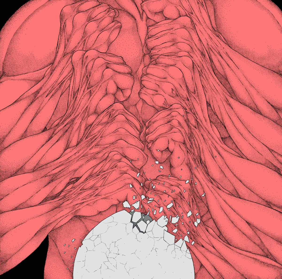
The cover art of Sam Nigrosh pushes Oozing Wound’s thrashcore jams into a blood-soaked space between comedy and horror. Compared to last year’s Retrash sleeve, which depicted a giant interstellar centipede gnawing through the spacesuit of a dying astronaut, the Earth Suck sleeve is thoughtful, even mannered, although an absurdist ferity endures. A personal reading is that the Earth Suck art symbolically describes the process of an idea becoming reality: on the front cover, a recursive circuit of knuckles and sinew pulverise a crumbling egg; on the back cover, a freshly-hatched brain drips with mucus.
12
dark0 - Fate
ARTISTS: MURLO & MR MITCH
[Gobstopper]

This surprisingly versatile image manages to condense an abundance of suggestion. Either loot or reward, a diamond floating above a podium unites the grandeur of JRPG OSTs and the futuristic Otherness of eskibeat. Unearthed within the mines of the Uncanny Valley, this immaculate gemstone could be on display in a digital igloo. The use of soft shadow creates a peaceful and enigmatic atmosphere. The passage of light across the surface of the dark stone evokes the glissando of a squarewave bass line. As a visual representation of the Gobstopper label’s emphasis on minimalist melodicism, this is nonpareil.
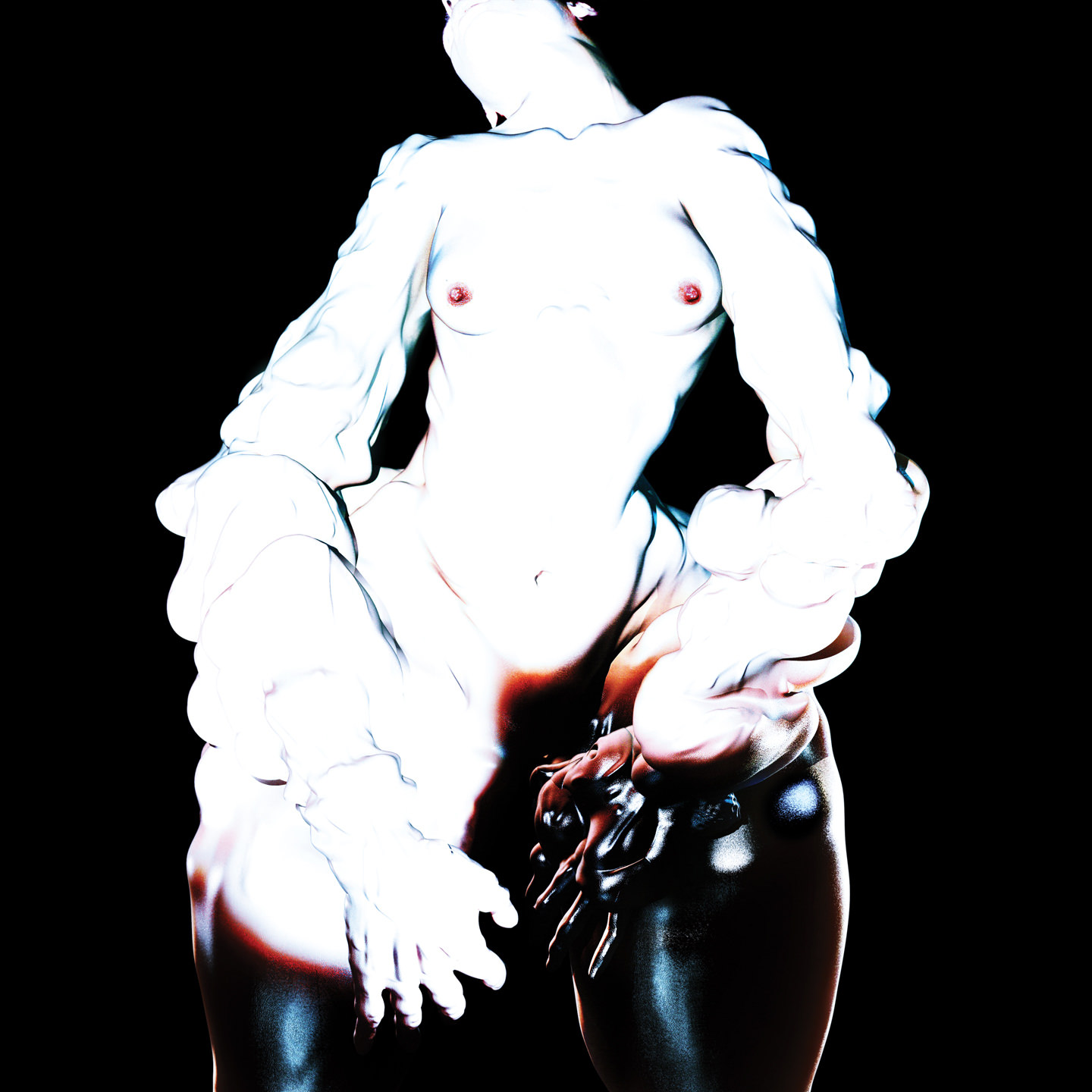
11
Ian Isiah - The Love Champion
ARTIST: JOE PEREZ
[Self-Released]

Rose flowers sprout from a pair of bejeweled hands locked around a pink pistol. The phallic portrayal of the firearm — just look at the vines on that thing — complicates a drearily familiar mainstream signifier of masculine aggression in a way that is both bawdy and lavish. Dick jokes aside, the Love Champion art looks like an advertisement for high-end masculine perfume — a glossy, airbrushed aporia in search of muscles. Joe Perez has transformed a free-to-download mixtape into a luxury item.
10
Rome Fortune - Small VVorld
ARTIST: ZOA
[Self-Released]

An intimate scene is scarcely disrupted by the threat of violence. Two tides run against one another here. First, there is the couple in the bath, their nakedness suggestive of revelation and disclosure, a single gaze made up of two aspects — masculine territoriality and feminine disgust. The quiet confidence of this dispassionate duo undermines the rhetorical power of the gun. There is something unconvincing about this weapon in the center of the frame. It has induced the woman to cover her breasts. We could live without that. We want truth and honesty, epiphany and nakedness. Perhaps the unconvincing thing about this gun is that we, the audience, seem to be holding it. Who are we? What do we want from Rome Fortune? What is Rome Fortune going to give us?
09
Arca - Xen
ARTIST: JESSE KANDA
[Mute]
The eponymous, androgynous Xen is a digital being whose anti-aliased portraits populate Jesse Kanda’s eerie album art. Within the framework of Kanda’s haute Weird blend of the Sexy and the Wrong, the lopsided rhythms and dissonant electronic textures of Xen throb with all the nauseating energy of a repressed desire. By the same token, Kanda’s computer-generated teratology profits enormously from its association with his housemate Arca’s hallucinatory trap-art.
08
Mo Kolours - Mo Kolours
ARTIST: MIJU LEE
[One-Handed]

Both soulful and delicate, this stark ideogram of an annular head pared down to its anthropomorphic essentials resembles a melancholy vinyl disc. Its curious gaze addresses the viewer from the center of this eloquent illustration. For Korean artist Miju Lee, the purpose of art is to make contact with the world. To this end, her miniature sculptures can be found dotted throughout her adopted hometown of Barcelona. Furthermore, her love of visual puns can even be enjoyed at the dinner table.
07
copeland - Because I’m Worth It
ARTIST: n/a
[Self-Released]

Hype Williams’ refusal to speak clearly was itself interpreted as clear speech. The slippery, amorphous nature of their art was a large part of its appeal. A personal opinion is that the band became a bigger story than anything specific they tried to accomplish: the impact of their art became limited by their own presence. Their audience got used to them. There was never supposed to be a grand narrative about the relationship between Dean and Inga, that’s just how things turned out — they weren’t even supposed to change the band name, nobody was supposed to care. The dual solo act retains their audience and doubles their money. In 2011, Inga observed: “if you make music under an umbrella of an atmosphere, you can change the sound completely, or you can get rid of your gimmicks or whatever and do something else, still doing the same thing within your sort of intention.” Because I’m Worth It is a Hype Williams atmosphere with Inga on the cover. What makes this image of a glassy-eyed, greasy-haired Inga so powerful isn’t the anti-corporate message it apparently transmits, but the possibility that this gesture of unmediated rawness is just another artistic imposture.
06
Hookworms - The Hum
ARTIST: JW
[Domino]
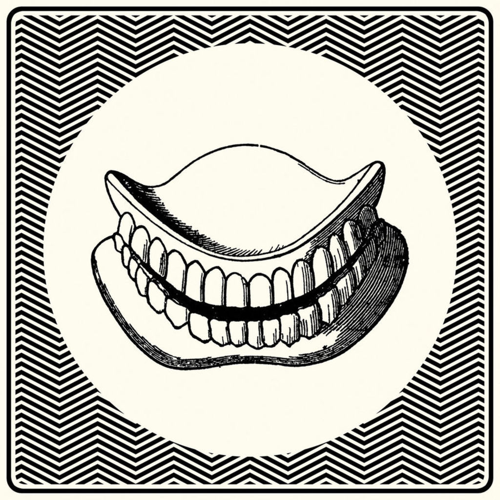
You draw these false teeth from their die-cut sleeve. Sourced from a 19th-century medical textbook, they are awkward but vital. Without them, you can’t speak, can’t smile, can’t eat. They are at once weapon and lifesaver, filter and preamp.
05
SOPHIE - Lemonade
ARTIST: SOPHIE
[Numbers]

The sonic and visual art of SOPHIE is self-consciously grounded in the act of processing materials according to their inherent properties. The essentialist (molecular) aspect of his work is hard to miss: his jerky, mechanical body music never digresses into musicality for its own sake; his command of his own message makes his responses to interview questions seem a priori. According to SOPHIE: “Aesthetic aims should be secondary to conceptual aims, otherwise you end up with music that is driven by stylistic references rather than its actual content.” The content — understood as essence — is the key. LEMONADE is a study of effervescence. A corkscrew flume (water slide 02 am94) dangles like lemon peel. Freed of function and estranged from its social context, its formal qualities are emphasized, its sensual qualities exaggerated.
04
Eric Copeland - Logo My Ego
ARTIST: ERIC COPELAND
[L.I.E.S.]
![]()
A smudgewave aesthetic smears discordant concepts into a tape-saturated whole. Its primitive analogue processes emphasize trash and dirt, its practitioners magpie whimsy from the post-everything archive of the web. The world is your bedroom. To create is to assemble. Sounds become grooves when they are found, fixed, and altered. Images become covers when they are sliced up and taped back together. Smudgewave is too serious, too involved, to be purely Pop; and it’s too dumb, too spontaneous, to be purely Conceptual. Asked to situate his experimentalism within a wider cultural milieu, New York-based collagist Eric Copeland responded: “I want to have some seriousness, and demonstrate some things I think are really important and maybe hidden in it, but then I want it to be attractive in a stupid way. I don’t think there’s anything bad about something being dumb or idiotic or really basic. I don’t know if that’s cartoony, but I think I share a cultural space with it.”
03
Rustie - Green Language
ARTIST: SIMEN JOHAN
[Warp]
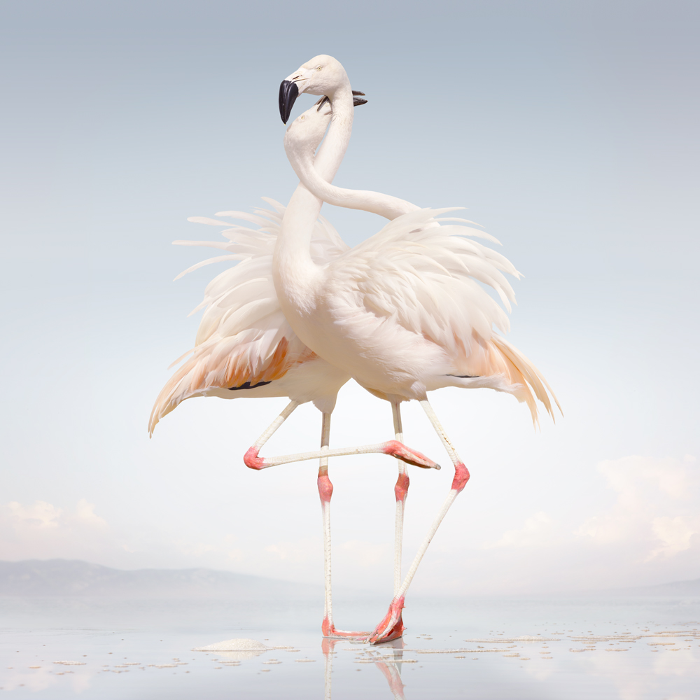
Birds in general disturb human perspectives: their eyesight is keener, their horizons wider; their use of song makes them seem inherently musical. These charismatic flamingos, social creatures of color and dance, represent an ideal for living on the front of Rustie’s Green Language. The longer one looks at them, the more human they seem. They could be any couple in a corner at the club, the figure on the left nagging haptic at the collar of the figure on the right. The comparison doesn’t make them seem humdrum; it reminds us that humans can be strange and graceful. This digitally-altered photoprint (Untitled 163, 2011) is part of an ongoing series called Until The Kingdom Comes by New York-based Norwegian artist Simen Johan. Johan prints inverse “negatives” of his computer-manipulated photographs onto transparent film, allowing him to produce hyperrealistic prints using darkroom processes.
02
Burial Hex - The Hierophant
ARTIST: BERNAT ARMANGUE
[Handmade Birds]

The dynamism and expressiveness of this photograph are created by the contrast between the crimson horns smeared across the floor and the blood-stained horns of the fallen bovine. Although we are in the presence of death, the point of intersection between the throat of the bull and the sickle-like contours of blood suggests a fantastic parody of breath. In the context of Kevin Gan Yuen’s opulent presentation of The Hierophant, Catalan photojournalist Bernat Armangue has (intentionally or not) produced an image rich in Mithraic connotations.
01
FINISHED - Their Is No God
ARTIST: E3
[A1 Tapes]
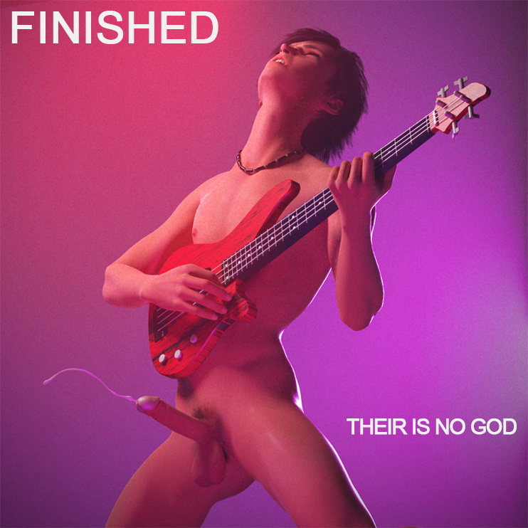
Music is either NSFW or it is nothing.
We celebrate the end of the year the only way we know how: through lists, essays, and mixes. Join us as we explore the music and films that helped define the year. More from this series