Robert Beatty is Lexington, Kentucky’s resident visual/audio/multimedia artist, a longtime member of noise innovators Hair Police, the man behind Three Legged Race, and one of the most sought after figures in underground album art. He recently released a chilling 12-inch slab of proto-techno titled Wrong Element on the Acoustic Division label and has a lot more planned for 2012, including a new Spectrum Spools LP and more endless streams of psychedelic, airbrush via Photoshop artwork, soon to grace your favorite new records.
What are your thoughts on the current state of album art? There aren’t many instantly recognizable artists floating around, but rather certain trends, like vintage collaging, that are being widely used. Do you feel a part of any specific movement like that?
I am pretty turned off by a lot of current record cover art. So much of it seems tossed off and lazy, but then again so does a lot of the music it is framing. It seems that with so much anonymous imagery being available on the internet, appropriation has stopped being a tool to transform the existing in something new and has become an easy way out. People seem so eager to adopt an aesthetic they view as desirable without trying to add anything of their own to it or creating something new. I’m sure this is a byproduct of the immediacy of the internet and the fact that most people only see record covers as a tiny thumbnail on a screen now.
People often see my work and assume it is appropriated because of the techniques I use, but I hope I am bringing something new to a tradition that I feel is greatly neglected now. I don’t think people are used to seeing so much work being put into something that for most people is secondary to the music. I try to make each cover fit the music as well as I possibly can and also put as much of myself into the work as possible. It’s very easy with Tumblr and other such blogs to just become another anonymous jpeg in a never ending stream of imagery. All in all, I’m just trying to make the best work I can for the music that I’m doing it for and always pushing myself to do new things and avoid falling into any sort of trends.
Do you see any merit in really simple collage art then, where two or three images have been thrown together? I guess it depends on the piece, but with your work you typically have at least some drawn element in there, right?
I am a huge fan of collage and a lot of the work I do is basically collage at the core, just made of elements that I created. I use collage all the time for show fliers and other things that a lot of people don’t see, but I try to always add something or combine things in an unexpected way. I’m not against appropriation at all, I just feel a lot of times it stems from laziness and imitation. The simplest solutions are most of the time the best and I often wish my work ended up being simpler than it is.
It can be hard to get really simple, it seems like the more work you do, the tendency is to pile more elements on. Not you specifically, but in general.
I just tend to end up with images that are way more complicated than they need to be. I’m pretty psyched about the new Peaking Lights record cover I did because of how simple it is.
I’m looking at that on your flickr right now, did they want something that stripped down?
With that one they gave me a sketch of what they wanted that was actually more elaborate than the finished product and I went from there.
At first I was kind of taken aback by how bare it is, but then I started imagining it on an actual LP sleeve and I really like it in that light.
Yeah. I wish I did more things like that. It’s hard working on the computer to visualize how something will look once it’s on an actual record cover.
Anyway, the one thing I was wanting to get at when I brought up the collage shit was the idea of professional artists versus non-professionals. I guess training versus no training. In some ways everyone is an artist and musician now.
Well technically, I am an untrained artist. I’ve never gone to school for art.
Did you draw a lot as a kid?
Yeah, I drew all the time when I was a kid. It’s basically all I did.
Unless someone has a specific concept, Challenger is usually the first reference point when people tell me what they want in a cover.
What were some childhood and teenage influences?
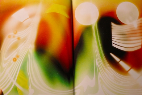
I’ve always been a huge fan of animation and I feel like that has informed my work more than anything. Seeing things like Terry Gilliam’s animated sequences in Monty Python and weird Eastern European animation on the University of Kentucky Arts channel. I was pretty into to comic books when I was a teenager, so I’m sure that helped as well. There are so many things that influenced me that I loved when I was younger — Cal Schenkel’s art for the Mothers of Invention records, the art on a lot of the mid 1990s Matador records, Rene Laloux and Roland Topor’s Fantastic Planet, Alan Aldridge’s Beatles Illustrated Lyrics book, Grand Royal Magazine.
It seems like you mostly work on show fliers and album covers now, I’m guessing because they pay the bills. Do you prefer doing personal work or commissioned stuff?
I enjoy doing both and I try to keep a good balance between the two. I just enjoy doing art in any way, so it’s nice to be able to do it all the time
I’m also wondering how you approach covers for your own records versus a stranger’s; is there any important difference?
I actually have a relatively hard time coming up with art that I am happy with for my own music, specifically Three Legged Race stuff, which is just me. I often end up turning to doing something hand-drawn because it feels more appropriate.

Do you feel pressure to repeat a formula that has been successful for you in the past? I know you’ve said before that people usually want a retread or some variation of the cover you did for Burning Star Core’s Challenger LP.
It’s tough because I don’t want to repeat myself and people have some expectations when they ask me to do a cover. Unless someone has a specific concept, Challenger is usually the first reference point when people tell me what they want in a cover. I’ll never live that one down. I definitely try to switch up my style from project to project. The airbrush style seems to be what most people want, but I’m always more excited to try something different rather than do something I’ve done before.
I think a lot of artists are trying to sell an ambiguous idea that your airbrush style conveys, it’s almost like a comfort, maybe? Or why has that style caught on?
I think the appeal is that it evokes something that people can’t place. It definitely calls to mind the past, but I feel like there is a lot of potential in it to say something new. I like the idea that is so often associated with trash culture now, even though it used to be on the cover of every major magazine.
It’s interesting that old styles are being used to express more modern ideas, how all these things from the past are new conduits, there’s something almost demented about it.
Yeah. I feel like things move too fast now and tools that are still useful are being left behind without seeing their full potential. Also, the time commitment to learning traditional airbrush work is offset now by being able to imitate it with a computer.
There are a few artists now who seem to match that level of detail and work. Who is the guy who did The Sword album cover, and Dylan Ettinger’s New Age Outlaws?
Dan McPharlin.
Yes! The craft in his work seems really intense.
His work is really amazing, but I feel like it’s a little too close to tradition for my tastes. Like some of it looks exactly like Roger Dean.
I guess things like that stick out now because the craft is so apparent, and that kind of labor is rare.
Yeah for sure, he’s a madman.
But in some ways I like that the culture has de-valued craft.
I feel like anyone who is putting work into what they are doing now gets noticed. Lots of stuff is so lazy if you do any amount of noticeable work you stand out. It’s nice to see an image and have no idea how it was made and be confused rather than underwhelmed.
So you do value that kind of work in others art? I keep thinking of this Julia Holter quote that was circulating around TMT recently, which basically set the parameters for what ‘good art’ was based on the level of labor put into it.
I think craft and a solid work ethic are very important to any artist or musician, but that’s not the be-all, and end-all, of it. I think moreso than craft I value aesthetics that bring out the personality or heart of the person making it. Something that makes it unique. Most of the time that doesn’t come easy, so there’s often a lot of work to reach that point.
So valuing truth or authenticity in art? Like, working up to a point where you can use tools to express a part of yourself in a seamless way?
Yeah, exactly, it’s knowing how to express yourself. I feel like it doesn’t matter whether or not someone knows what they are doing. People who are trained in art are often trained in the bullshit that goes along with it, so I often appreciate the work of “amateurs” just as much.
Are there any particular pieces you’ve done that have fallen into place exactly as you intended? How often does the image in your mind translate accurately to a finished project?
There’s always a process involved with every project and they all vary a lot. Sometimes thinking about a cover is more important than the actual work. Sometimes I’ll try to work on something for weeks and then things will just fall into place in an hour and be perfect. The Idiot Glee Paddywhack cover is an example of that. The covers I’ve done for Ga’an are probably the ones that have turned out closest to the idea I had in my head at the start.

A lot of your work almost seems like it’s set on the same alternate world, with similar characters popping up. How intentional is that?
I use several elements over and over, so things are linked that way to some common environment. It’s more like a language than another world. Just using the same pieces to communicate different things.
I’m interested in the pieces you did for the Kramers Ergot, they seem like a departure from your more iconic, symmetrical work. How did all of that come about?
I approached the work I did for Kramers Ergot very differently than I do when starting on a record cover. After I had completed the cover design, editor Sammy Harkham asked me to create a few pages of art to serve as in introduction or sort of overture to the book. I was viewing it as a way for people to cleanse their visual palate before diving into the rest of the collection. I had to create quite a bit of art in a relatively short time, so I took a more process-oriented approach. It was much more loose and improvisational than I normally work when creating art. I just starting making things to see where they would take me rather than having a concept from the start. I took a lot of inspiration from the films of John and James Whitney, Jordan Belson, and the star gate sequence from 2001, but I was trying to use those as a starting point rather than making direct references. I couldn’t believe it when I was asked to contribute, and I’m really happy with the way my contributions turned out. It was a great experience and an honor to be involved.
Can you tell me about the installation exhibit you did in Lexington, Cream Grid Reruns?
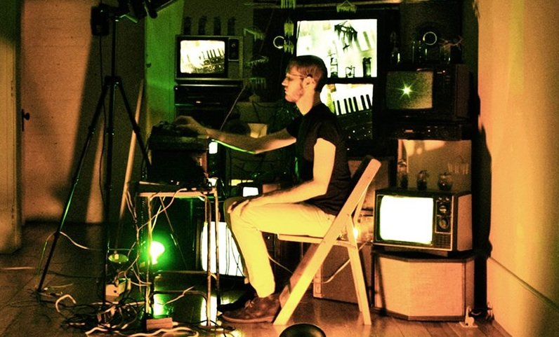
I did an installation at a great gallery here in Lexington called Insitute 193. This was the first time I had ever done a solo exhibition of my art, so I wanted to do something I’ve never done before. The majority of the space was taken up by a floor to ceiling assemblage of televisions, speakers, electronics, plants, and wax chandelier sculptures I had made. I made a video of semi-narrative sci-fi/horror vignettes that related to some of the pieces in the show that was showing on all of the televisions. I also had a few vertical sculptural and drawing diptychs. It was pretty different than what most people have seen from me, but I think it relates well to my other work and I look forward to doing more installations in the future. You can see photos of the installation at the Institute 193 website.
There seems to have been some really interesting things going on in Lexington for a while.
Yeah there’s definitely a lot of good things going here, and it’s only getting better. There are tons of amazing bands and inspiring creative people here. It’s a really small scene, but things are always growing and changing so it keeps things interesting and truly weird. Some bands to check out are Attempt, Jovontaes, Wretched Worst, Cross, Matt Duncan, Idiot Glee, Arcane Rifles, Auto Delta Time, Ellie Herring, Trailblazer, Silverware, tons more! A ton of people from those bands also participate in the Resonant Hole project that we’ve been doing for a couple years now. Lexington is a great place to live and make art and music.
Lots of stuff is so lazy if you do any amount of noticeable work you stand out. It’s nice to see an image and have no idea how it was made and be confused rather than underwhelmed.
Let’s get into your upcoming music projects, you have an LP coming, right? Is there also a new Hair Police record in the works?
I just finished my first full length LP under the name Three Legged Race entitled Persuasive Barrier. It’s coming out on Spectrum Spools in late summer. It’s comprised of recordings I’ve been working on since 2008 and it’s not much like anything I’ve released before. It’s a combination of what I like to think of as electro-exotica and some more abstract musique concrete pieces. I’ve got a few more releases planned after that, it should be a good year.
Hair Police also just finished a new full length entitled Mercurial Rites.We worked on it off and on for a couple years and it’s the first thing we’ve released in a while. It’ll be coming out on Gods of Tundra later this year. I definitely think it’s the weirdest record we’ve made in a while and breaks some new ground.
We’ve got lots of new stuff coming from the Resonant Hole project as well, including a 7” on PAN and a 12” on Acoustic Division who also just released a Three Legged Race 12.” There will be a second volume of a Resonant Hole compilation coming later as well that we’ve been working on for a while. C. Spencer Yeh and I are also working on a collaborative LP that won’t be Burning Star Core. Who knows what that will end up being like!
Are there any specific goals or ambitions you have in your music?
Hopefully I’m leaving people with more questions than answers. I’ve got nothing to prove, but a lot to prod. I just want to keep making insane and adventurous music and art and doing things I haven’t done before. I’m trying to just take everything I like and mix it together to create something new and exciting. Confusion is sex, and I will continue to hide behind the curtain so people never quite know what’s happening.
I’ll wrap up by throwing out some random questions. What’s your favorite font?
I am pretty obsessed with Microgramma bold. It’s kind of a boring font that you see everywhere, but I love how industrial and stark it feels.
As you get older, do you find less inspiration in music and art?
No, the exact opposite. The older I get the more I want to do. I wish I had more time in the day or a couple clones.
In relation to music and art, is cynicism a totally negative force?
I think there is a certain power in being skeptical and questioning things, but I try to be encouraging to others around me and keep a positive outlook most of the time. Complaining about things you can’t control doesn’t get you anywhere. I am always excited to try new things and push myself to do things I’ve never done before. There’s a lot of bullshit in this world and I hope I’m not contributing to it.
How important is success to you at this stage in your life?
I’m just happy to be doing what I want to be doing and hope to be able to keep it up. I’m not trying to get rich, but it would be nice to make a comfortable living doing art and music. I ended up where I am playing noise music in shitty basements for nothing, so I’m pretty happy with how far I’ve come.
[Photo: Jaime Lazich]