We celebrate the end of the year the only way we know how: through lists, essays, and mixes. Join us as we explore the music and films that helped define the year. More from this series
20
VHS Head - Persistence Of Vision
ARTIST: MICHAEL ENGLAND
[Skam]
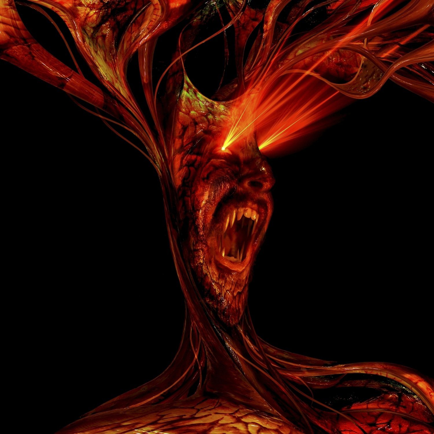
Cephalopodan appendages splay like cosmic antlers and rave lasers fire from squinting eyes. With its fanged maw opened wide, this digital fiend could be roaring in dismay at its own reflection or simply chortling at a passing puny mortal. Mysterium tremendum et fascinans. Both ridiculous and slightly terrifying, Michael England’s pop surrealist homage to video nasty kitsch is the perfect complement to VHS Head’s gory microhouse repurposing of supernatural horror and slasher cinema.
19
Ignatz & De Stervende Honden -Teenage Boys
ARTIST: DENNIS TYFUS
[Ultra Eczema]

This two-color screenprinted sleeve playfully refers to the psychedelic potential of reflection. The anamorphic use of feminine features and soft curves in a queasy pastel haze recall the artist’s earlier work for Jessica Rylan and Samara Lubelski. Belgian artist and provocateur Dennis Tyfus began the Ultra Eczema label as a bad taste zine before branching out into noise-rock, tees (UE06), tattoos (UE50) and soccer teams (UE164). Asked to describe the ideal Ultra Eczema project, Tyfus replied: “Three babies, signed and handnumbered. All their sounds will be recorded non-stop and every sound will appear on brown vinyl packed in a diaper. If I had the time to raise them, I would only sing to them, no talking, just singing.”
:format(jpeg):mode_rgb()/discogs-images/R-739605-1336940428-1857.jpeg.jpg)
:format(jpeg):mode_rgb()/discogs-images/R-5544024-1396116724-7548.jpeg.jpg)
18
Michael Jackson - Xscape
ARTIST: n/a
[Epic]

A world-historical figure is partially obscured within a cosmic bodystocking. Victor Hugo once described the octopus (“the sea vampire”) as “a sleeve sewn up with a closed fist within.” The figure on the cover of Xscape is similarly stuffed with oddly violent connotations. Jackson’s intergalactic cloak seems to confirm his pre-eminence in the firmament, but a vortex swirling about his ears threatens to consume him completely. The singer himself seems predatory, lurking behind his interstellar veil, watching, waiting; an ambush waiting to happen. He is a young and anxious God, scanning the souls of the faithful, determined not to be forgotten.
17
Moodymann - Moodymann
ARTIST: KEN KARNER
[Mahogani]

There was a time when Kenny Dixon Jr. barely existed as a visual image. The monochrome portrait from the cover of his debut album, Silentintroduction, would serve as the seal of quality: confirmation that, yes, that hypnotic 11-minute analogue house track that sounds like it was produced by Moodymann was, in fact, produced by Moodymann. Such putative anonymity felt contrived even at the time. Nobody sounds like Moodymann, not really; especially not when KDJ takes to the mic and starts to mutter his hedonistic daydreams aloud. Ken Karner’s cover art for the Moodymann album illustrates how caricature provides its own level of anonymity: the oddball party animal that exists on record assumes the form of a beer-bellied giant on the poster of his own Blaxploitation movie.
16
Kris Wadsworth - Popularity
ARTIST: ZEKE CLOUGH
[Hypercolour]

Skulls, robots, skulls, breasts, eyeballs, breasts, skulls, ghosts, trees, saws, sores, skulls, spines, brains, breasts, and skulls: the discarded ideograms of a Crumbian nightmare writhe and sprawl in groggy rapture. Zeke Clough’s illustrations are always a riot. Although his frenzied cartoons will often be tied to the releases of DJ/producer Shackleton, whose singular mythstep aesthetic he helped create, Clough’s other works deserve wider acclaim. His Popularity sleeve merges Savage Pencil’s spontaneous anarchy of line with Basil Wolverton’s meticulous grotesques.
15
Wrekmeister Harmonies - Then It All Came Down
ARTIST: SIMON FOWLER
[Thrill Jockey]

After printmaker Simon Fowler worked on the cover of the previous Wrekmeister Harmonies album, he uploaded a time-lapse recording of the process to Vimeo (you can watch it here). This time around, Thrill Jockey shared an animated .GIF he made of his work on Then It All Came Down. Fowler is clearly proud of his craft, and rightly so: his painstaking method of intaglio engraving is as much a matter of patience and attention to detail as it is a matter of skill. 2014 has been something of an annus mirabilis, with the London-based artist producing a series of standout covers for The Bug (including this beauty), Dead Fader, and Bathetic Records. Then It All Came Down is his best cover yet: full of magic and foreboding, its etched grooves ooze an inky dread.
14
Carla Bozulich - Boy
ARTIST: CARLA BOZULICH
[Constellation]

A wild colt, free from the herd, rears on its hind legs in a defiant moment of solitary zeal. A vibrant storm of pink stars and yellow spirals, set against the charcoal black of night, conveys a turbulent emotional state. If Boy was the first pop album of Carla Bozulich’s career, this iridescent sleeve marked the occasion with an appropriate sense of heightened optimism. Long-term fans of Bozulich are entitled to wonder if this horse is related in some way to the five-legged creature on the cover of Ethyl Meatplow’s Whore 7-inch.
13
Oozing Wound - Earth Suck
ARTIST: SAM NIGROSH
[Thrill Jockey]
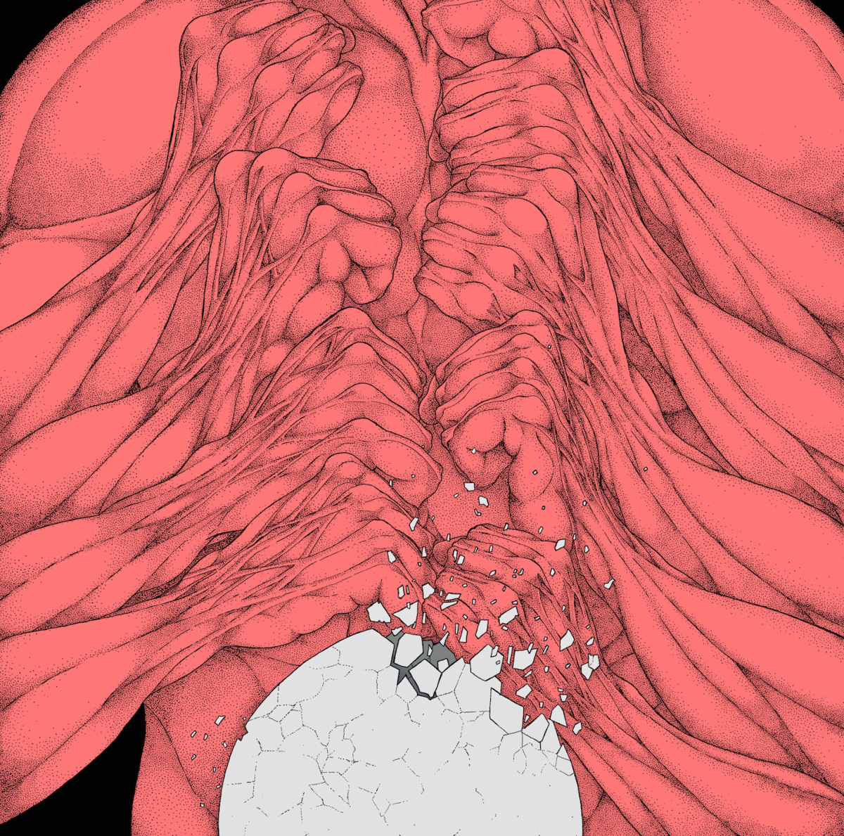
The cover art of Sam Nigrosh pushes Oozing Wound’s thrashcore jams into a blood-soaked space between comedy and horror. Compared to last year’s Retrash sleeve, which depicted a giant interstellar centipede gnawing through the spacesuit of a dying astronaut, the Earth Suck sleeve is thoughtful, even mannered, although an absurdist ferity endures. A personal reading is that the Earth Suck art symbolically describes the process of an idea becoming reality: on the front cover, a recursive circuit of knuckles and sinew pulverise a crumbling egg; on the back cover, a freshly-hatched brain drips with mucus.
12
dark0 - Fate
ARTISTS: MURLO & MR MITCH
[Gobstopper]

This surprisingly versatile image manages to condense an abundance of suggestion. Either loot or reward, a diamond floating above a podium unites the grandeur of JRPG OSTs and the futuristic Otherness of eskibeat. Unearthed within the mines of the Uncanny Valley, this immaculate gemstone could be on display in a digital igloo. The use of soft shadow creates a peaceful and enigmatic atmosphere. The passage of light across the surface of the dark stone evokes the glissando of a squarewave bass line. As a visual representation of the Gobstopper label’s emphasis on minimalist melodicism, this is nonpareil.
11
Ian Isiah - The Love Champion
ARTIST: JOE PEREZ
[Self-Released]

Rose flowers sprout from a pair of bejeweled hands locked around a pink pistol. The phallic portrayal of the firearm — just look at the vines on that thing — complicates a drearily familiar mainstream signifier of masculine aggression in a way that is both bawdy and lavish. Dick jokes aside, the Love Champion art looks like an advertisement for high-end masculine perfume — a glossy, airbrushed aporia in search of muscles. Joe Perez has transformed a free-to-download mixtape into a luxury item.
We celebrate the end of the year the only way we know how: through lists, essays, and mixes. Join us as we explore the music and films that helped define the year. More from this series